Filter by
Storytelling with data : let's practice!
Influence action through data! This is not a book. It is a one-of-a-kind immersive learning experience through which you can become—or teach others to be—a powerful data storyteller. Let’s practice! helps you build confidence and credibility to create graphs and visualizations that make sense and weave them into action-inspiring stories. Expanding upon best seller storytelling with data�…
- Edition
- -
- ISBN/ISSN
- 9781119621492
- Collation
- -
- Series Title
- -
- Call Number
- 001.4226 Kna s

The Functional Art an Introduction to Information Graphics and Visualization
- Edition
- -
- ISBN/ISSN
- 9780321834737
- Collation
- -
- Series Title
- -
- Call Number
- 006.6 Cai f
- Edition
- -
- ISBN/ISSN
- 9780321834737
- Collation
- -
- Series Title
- -
- Call Number
- 006.6 Cai f
Microsoft Power BI cookbook : convert raw data into business insights with up…
Since its first edition the Power BI Cookbook has been a best-selling resource for BI developers and data analysts to produce impactful, quality BI solutions. This new and updated edition retains the rigorous details and concepts readers of prior editions have enjoyed while also demonstrating powerful new capabilities and updated guidance aligned to the current state of the platform. In this bo…
- Edition
- Third Edition
- ISBN/ISSN
- 9781835464274
- Collation
- 598 p.
- Series Title
- Expert insight
- Call Number
- 005.54 Dec m
Data visualization handbook
The popular Finnish information design book by Juuso Koponen and Jonathan Hildén, ?Tieto näkyväksi?, is now available in an English version, titled the ?Data Visualization Handbook?. Full of research on data visualisation and international examples of functional and inspiring information design, the publication is intended for anyone interested in deepening their understanding of how data is…
- Edition
- -
- ISBN/ISSN
- 9789526074498
- Collation
- 352 p. ; 25 cm.
- Series Title
- -
- Call Number
- 745.4 Kop d
Data analytics and visualization in quality analysis using Tableau
The purpose of this book is to help quality practitioners perform effective quality control and analysis using Tableau software, a user-friendly data analytics and visualization software. It covers basic introduction to quality analysis, features and functions and step-by-step instructions to use Tableau.
- Edition
- First edition
- ISBN/ISSN
- 9780367744144
- Collation
- -
- Series Title
- -
- Call Number
- 006.66 Hwa d
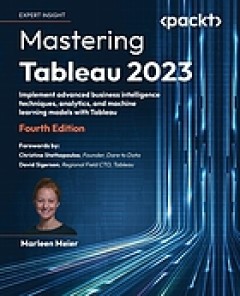
Mastering Tableau 2023 : implement advanced business intelligence techniques,…
This edition of the bestselling Tableau guide will teach you how to leverage Tableau's newest features and offerings in various paradigms of the BI domain. Index : page 647-655.
- Edition
- Fourth edition, 2023
- ISBN/ISSN
- 9781803233765
- Collation
- 684 p.
- Series Title
- Expert insight
- Call Number
- 005.74 Mei m

Infographics : the power of visual storytelling
- Edition
- -
- ISBN/ISSN
- 9781118421598
- Collation
- 263 p. ; 25 cm.
- Series Title
- -
- Call Number
- 760 Lan i
- Edition
- -
- ISBN/ISSN
- 9781118421598
- Collation
- 263 p. ; 25 cm.
- Series Title
- -
- Call Number
- 760 Lan i
Getting Started with SAS Programming : Using SAS Studio in the Cloud
This book uses short examples to teach SAS programming from the basics to more advanced topics in the point-and-click interactive environment of SAS Studio. Index : page 291-299.
- Edition
- -
- ISBN/ISSN
- 9781953329165
- Collation
- 316 p. ; 24,5 cm.
- Series Title
- -
- Call Number
- 519.50285 Cod g
Data for journalists : a practical guide for computer-assisted reporting. Fif…
Previous editions titled: Computer-assisted reporting.
- Edition
- Fifth Edition
- ISBN/ISSN
- 9780815370406
- Collation
- 231 p. ; 24 cm.
- Series Title
- -
- Call Number
- 070.43 Hou d

Foundations of Data and Digital Journalism
- Edition
- -
- ISBN/ISSN
- 9781032017747
- Collation
- 187 p. ; 26 cm.
- Series Title
- -
- Call Number
- 070.59 Ric f
- Edition
- -
- ISBN/ISSN
- 9781032017747
- Collation
- 187 p. ; 26 cm.
- Series Title
- -
- Call Number
- 070.59 Ric f
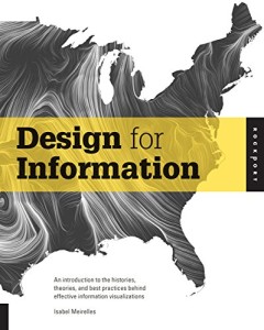
Design for information : an introduction to the histories, theories, and best…
Design for Information provides a series of visualizations that are analyzed for their design principles and methods. This book provides critical and analytical tools that benefit the design process.
- Edition
- -
- ISBN/ISSN
- 9781592538065
- Collation
- -
- Series Title
- -
- Call Number
- 745.2 Mei d
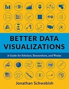
Better data visualizations : a guide for scholars, researchers, and wonks
This book details essential strategies to create more effective data visualizations. Jonathan Schwabish walks readers through the steps of creating better graphs and how to move beyond simple line, bar, and pie charts.
- Edition
- -
- ISBN/ISSN
- 9780231193115
- Collation
- -
- Series Title
- -
- Call Number
- 001.4226 Sch b
Visualizing health and healthcare data : creating clear and compelling visual…
The only data visualization book written by and for health and healthcare professionals. In health and healthcare, data and information are coming at organizations faster than they can consume and interpret it. Health providers, payers, public health departments, researchers, and health information technology groups know the ability to analyze and communicate this vast array of data in a clear …
- Edition
- -
- ISBN/ISSN
- 9781119680888
- Collation
- -
- Series Title
- -
- Call Number
- 610.21 Row v
Fundamentals of data visualization : a primer on making informative and compe…
Effective visualization is the best way to communicate information from the increasingly large and complex datasets in the natural and social sciences. But with the increasing power of visualization software today, scientists, engineers, and business analysts often have to navigate a bewildering array of visualization choices and options. This practical book takes you through many commonly enco…
- Edition
- -
- ISBN/ISSN
- 9781492031086
- Collation
- -
- Series Title
- -
- Call Number
- 001.4226 Wil f
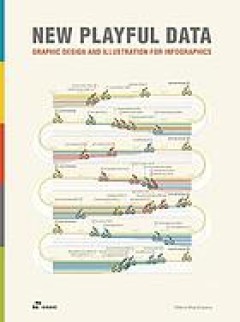
New playful data: graphic design and illustration for infographics
Playful Data: Graphic Design and Illustration for Infographics features brilliant and illustrative infographic projects from gifted graphic designers, illustrators, artists, and even scientists. Not only do they visualize data in a tangible and memorable way through playful illustrations, but they also provide us with inspiration for balancing colors, words, and images, as well as for distingui…
- Edition
- -
- ISBN/ISSN
- 9788417656416
- Collation
- -
- Series Title
- -
- Call Number
- 302.226 Sha n
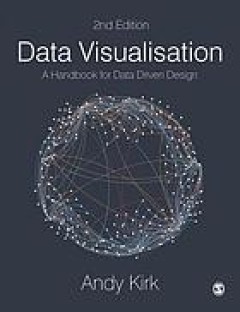
Data visualisation : a handbook for data driven design
One of the "six best books for data geeks" - Financial Times With over 200 images and extensive how-to and how-not-to examples, this new edition has everything students and scholars need to understand and create effective data visualisations. Combining ‘how to think’ instruction with a ‘how to produce’ mentality, this book takes readers step-by-step through analysing, designing, and cur…
- Edition
- -
- ISBN/ISSN
- 9781526468925
- Collation
- -
- Series Title
- -
- Call Number
- 001.4226 Kir d
This is service design methods : a companion to This is service design doing
In this book, you'll find 54 hands-on descriptions that help you do the key methods used in service design. These methods include instructions, guidelines, and tips-and-tricks for activities within research, ideation, prototyping, and facilitation. This is the print version of the method companion to the book This Is Service Design Doing (#TiSDD). It includes the same content that you can find …
- Edition
- -
- ISBN/ISSN
- 9781492039594
- Collation
- -
- Series Title
- -
- Call Number
- 658 Sti s

The Data journalist : getting the story
The definitive guide to using data and technology in reporting, this text teaches students how to combine data analysis with traditional reporting to create compelling stories. Through coverage of theory, practical examples, online tutorials, and celebrated stories from around the world, thistext demonstrates the tools and principles of data-driven journalism.
- Edition
- -
- ISBN/ISSN
- 9780199020065
- Collation
- xiii, 265 p. ; 23 cm.
- Series Title
- -
- Call Number
- 070.430285 Val d
Python: Data Analytics and Visualization
- Edition
- -
- ISBN/ISSN
- 9781788290098
- Collation
- 845 p. ; 24 cm.
- Series Title
- -
- Call Number
- 001.4226 Vot p
- Edition
- -
- ISBN/ISSN
- 9781788290098
- Collation
- 845 p. ; 24 cm.
- Series Title
- -
- Call Number
- 001.4226 Vot p
Big data visualization : learn effective tools and techniques to separate big…
Learn effective tools and techniques to separate big data into manageable and logical components for efficient data visualizationAbout This Book* This unique guide teaches you how to visualize your cluttered, huge amounts of big data with ease* It is rich with ample options and solid use cases for big data visualization, and is a must-have book for your shelf* Improve your decision-making by vi…
- Edition
- -
- ISBN/ISSN
- 9781785281945
- Collation
- 288 p. ; 24 cm.
- Series Title
- -
- Call Number
- 005.7 Mil b
 Computer Science, Information & General Works
  Philosophy & Psychology
  Religion
  Social Sciences
  Language
  Pure Science
  Applied Sciences
  Art & Recreation
  Literature
  History & Geography